Instructions
Requirements and Specifications

Source Code
# Initialize Otter
import otter
grader = otter.Notebook("hw3-diatom.ipynb")
# Assignment 3
import numpy as np
import pandas as pd
import altair as alt
from sklearn.decomposition import PCA
## Background: diatoms and paleoclimatology
Diatoms are a type of phytoplankton -- they are photosynthetic algae that function as primary producers in aquatic ecosystems. Diatoms are at the bottom of the food web: they are consumed by filter feeders, like clams, mussels, and many fish, which are in turn consumed by larger organisms like scavengers and predators and, well, us. As a result, changes in the composition of diatom species in marine ecosystems have ripple effects that can dramatically alter overall community structure in any environment of which marine life forms a part.
Diatoms have glass bodies. As a group of organisms, they display a great diversity of body shapes, and many are quite elaborate. The image below, taken from a Scientific American article, shows a small sample of their shapes and structures.
Because they are made of glass, diatoms preserve extraordinarily well over time. When they die, their bodies sink and form part of the sediment. Due to their abundance, there is a sort of steady rain of diatoms forming part of the sedimentation process, which produces sediment layers that are dense with diatoms.
Sedimentation is a long-term process spanning great stretches of time, and the deeper one looks in sediment, the older the material. Since diatoms are present in high density throughout sedimentation layers, and they preserve so well, it is possible to study their presence over longer time spans -- potentially hundreds of thousands of years.
A branch of paleoclimatology is dedicated to studying changes in biological productivity on geologic time scales, and much research in this area has involved studying the relative abundances of diatoms. In this assignment, you'll do just that on a small scale and work with data from sediment cores taken in the gulf of California at the location indicated on the map:
The data is publicly available:
> Barron, J.A., *et al.* 2005. High Resolution Guaymas Basin Geochemical, Diatom, and Silicoflagellate Data. IGBP PAGES/World Data Center for Paleoclimatology Data Contribution Series # 2005-022. NOAA/NGDC Paleoclimatology Program, Boulder CO, USA.
---
## Objectives
In this assignment, you'll use the exploratory techniques we've been discussing in class to analyze the relative abundances of diatom taxa over a time span of 15,000 years. This will involve practicing the following skills.
**Acquaint and tidy**
* data import
* handling NaNs
* transforming values
* assessing time resolution
**Exploratory analysis of individual variables**
* visualizing summary statistics
* density histograms and kernel density estimates
* describing variation
**Exploratory analysis of multiple variables**
* examining correlation structure
* computing and selecting principal components
* interpreting principal component loadings
* using principal components to visualize multivariate data
**Communication and critical thinking**
* summarizing results in written form
* suggesting next steps
---
## 0. Getting acquainted with the diatom data
In this assignment you'll focus less on tidying and more on exploration -- the data you'll work with are already tidy. So, in this initial part, you'll:
* import the data;
* examine its structure to get acquainted; and
* perform some simple preprocessing transformations to facilitate exploratory analysis.
The data are diatom counts sampled from evenly-spaced depths in a sediment core from the gulf of California. In sediment cores, depth correlates with time before the present -- deeper layers are older -- and depths are typically chosen to obtain a desired temporal resolution. The counts were recorded by sampling material from sediment cores at each depth, and examining the sampled material for phytoplankton cells. For each sample, phytoplankton were identified at the taxon level and counts of diatom taxa were recorded along with the total number of phytoplankton cells identified. Thus:
* The **observational units** are _**sediment samples**_.
* The **variables** are _**depth (age), diatom abundance counts, and the total number of identified phytoplankton**_. Age is inferred from radiocarbon.
* One **observation** is made at _**each depth**_ from 0cm (surface) to 13.71 cm.
The table below provides variable descriptions and units for each column in the dataframe.
Variable | Description | Units
---|---|---
Depth | Depth interval location of sampled material in sediment core | Centimeters (cm)
Age | Radiocarbon age | Thousands of years before present (KyrBP)
A_curv | Abundance of *Actinocyclus curvatulus* | Count (n)
A_octon | Abundance of *Actinocyclus octonarius* | Count (n)
ActinSpp | Abundance of *Actinoptychus* species | Count (n)
A_nodul | Abundance of *Azpeitia nodulifer* | Count (n)
CocsinSpp | Abundance of *Coscinodiscus* species | Count (n)
CyclotSpp | Abundance of *Cyclotella* species | Count (n)
Rop_tess | Abundance of *Roperia tesselata* | Count (n)
StephanSpp | Abundance of *Stephanopyxis* species | Count (n)
Num.counted | Number of diatoms counted in sample | Count (n)
The cell below imports the data.
# import diatom data
diatoms_raw = pd.read_csv('data/barron-diatoms.csv')
diatoms_raw.head(5)
The data are already in tidy format, because each row is an observation (a set of measurements on one sample of sediment) and each column is a variable (one of age, depth, or counts). However, examine rows 3 and 4. These rows illustrate two noteworthy features of the raw data:
1. NaNs are present
2. The number of individuals counted in each sample varies by a lot from sample to sample.
Let's address those before conducting initial explorations.
### 'Missing' values
The NaNs are an artefact of the data recording -- if *no* diatoms in a particular taxa are observed, a `-` is entered in the table (you can verify this by checking the .csv file). In these cases the value isn't missing, but rather zero. These entries are parsed by pandas as NaNs, but they correspond to a value of 0 (no diatoms observed).
### Q0 (a). Filling NaNs
Use `.fill_na()` to replace all NaNs by zeros, and store the result as `diatoms_mod1`. Store rows 4 and 5 (index, not integer location) of the resulting dataframe as `diatoms_mod1_sample` and print it out.
(*Hint*: check the [documentation](https://pandas.pydata.org/docs/reference/api/pandas.DataFrame.fillna.html) for `fill_na()`.)
diatoms_mod1 = diatoms_raw.fillna(0)
# print rows 4 and 5
diatoms_mod1_sample = diatoms_mod1.iloc[4:6, :]
print(diatoms_mod1_sample)
grader.check("q0_a")
### Varying total counts
Since the total number of phytoplankton counted in each sample varies, the raw counts are not directly comparable -- *e.g.*, a count of 18 is actually a *different* abundance in a sample with 200 individuals counted than in a sample with 300 individuals counted.
For exploratory analysis, you'll want the values to be comparable across rows. This can be achieved by a simple transformation so that the values are *relative* abundances: *proportions* of phytoplankton observed from each taxon.
### Q0 (b). Counts to proportions
Convert the counts to proportions by dividing by the relevant entry in the `Num.counted` column. There are a few ways to do this, but here's one approach:
1. Set Depth and Age to row indices using `.set_index(...)` and store the result as `diatoms_mod2`.
2. Store the `Num.counted` column from `diatoms_mod2` as `sampsize`.
3. Use `.div(...)` to divide entrywise every column in `diatoms_mod2` by `sampsize` and store the result as `diatoms_mod3`.
4. Drop the `Num.counted` column from `diatoms_mod3` and reset the index; store the result as `diatoms`.
Carry out these steps and print the first four rows of `diatoms`.
(*Hint*: careful with the `axis = ...` argument in `.div(...)`; you may want to look at the [documentation](https://pandas.pydata.org/docs/reference/api/pandas.DataFrame.div.html).)
# set depth, age to indices
diatoms_mod2 = diatoms_mod1.set_index(['Depth', 'Age'])
# store sample sizes
sampsize = diatoms_mod2['Num.counted']
# # divide
diatoms_mod3 = diatoms_mod2.div(sampsize, axis = 0)
# drop num.counted and reset index
diatoms = diatoms_mod3.drop(columns = ['Num.counted']).reset_index()
# print
diatoms.head()
grader.check("q0_b")
Now that the data are ready for exploratory analysis, take a moment to think about what the data represent. They are relative abundances over time; essentially, snapshots of the community composition of diatoms over time, and thus information about how ecological community composition changes.
Before diving in, it will be helpful to resolve two matters:
1. How far back in time do the data go?
2. What is the time resolution of the data?
### Q0 (c). Time span
What is the geological time span covered by the data? Compute the minimum and maximum age using `.aggregate(...)` and store as `min_max_age`.
*Note*: This may be a new function for you, but it's simple: it takes as an argument a list of functions that will be applied to the dataframe (columnwise by default). So for example, to get the mean and variance of each column in `df`, one would use `df.aggregate(['mean', 'var'])`. See the [documentation](https://pandas.pydata.org/docs/reference/api/pandas.DataFrame.aggregate.html) for further examples.
(*Remember*: age is reported as thousands of years before present, so `Age = 2` means 2000 years ago.)
min_max_age = diatoms['Age'].aggregate(['min', 'max'])
min_max_age
grader.check("q0_c")
### Q0 (d). Time resolution
How are the observations spaced in time?
#### (i) Make a histogram of the time steps between consecutive sample ages.
Follow these steps:
1. Extract the `Age` column from `diatoms`, sort the values in ascending order, compute the differences between consecutive rows, and store the result as `diffs`.
+ *Hint*: use `.sort_values()` and `.diff()`.
+ *Notice*: that the first difference is NaN, because there is no previous value to compare the first row with. Drop this entry when you store `diffs`.
2. Make a simple count histogram (no need to manually bin or convert to density scale) with bins of width 0.02 (20 years).
+ Label the x axis 'Time step between consecutive sample ages'
# store differences
diffs = pd.DataFrame(diatoms['Age'].sort_values(ascending= True).diff().round(2).iloc[1:])
diffs = diffs.rename(columns={'Age': 'diff'})
# construct histogram
diffs.hist()
grader.check("q1_d_i")
#### (ii) What is the typical time step in years?
_From the histogram we can see that the time step is not fixed, but the most frequent value (typical time step) is around 0.04 which is 0.04*1000 = 40 years ._
---
## 1. Exploring diatom taxon abundances
Recall that the first type of exploratory analysis question has to do with exploring variation in each variable; to begin, you'll examine the variation in relative abundance over time for the eight individual taxa.
Here are some initial questions in this spirit that will help you to hone in and develop more focuesed exploratory questions:
* Which taxa are most and least abundant on average over time?
* Which taxa vary the most over time?
These can be answered by computing simple summary statistics for each column in the diatom data.
### Q1 (a). Summary statistics
Use `.aggregate(...)` to find the mean and standard deviation of relative abundances for each taxon. Follow these steps:
1. See Q0 (c) for an explanation of `.aggregate(...)`.
2. Drop the depth and age variables before performing the aggregation.
3. Use `.transpose()` to ensure that the table is rendered in long form (8 rows by 2 columns rather than 2 columns by 8 rows).
4. Store the result as `diatom_summary` and print the dataframe.
diatom_summary = diatoms.drop(columns=['Depth', 'Age']).aggregate(['mean', 'std']).transpose()
# print the dataframe
diatom_summary.head()
grader.check("q1_a")
It will be easier to determine which taxa are most/least abundant and most variable by displaying this information visually.
### Q1 (b). Visualizing summary statistics
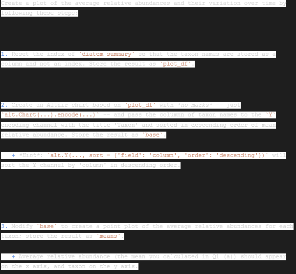
Create a plot of the average relative abundances and their variation over time by following these steps:
1. Reset the index of `diatom_summary` so that the taxon names are stored as a column and not an index. Store the result as `plot_df`.
2. Create an Altair chart based on `plot_df` with *no marks* -- just `alt.Chart(...).encode(...)` -- and pass the columnn of taxon names to the `Y` encoding channel with the title 'Taxon' and sorted in descending order of mean relative abundance. Store the result as `base`.
+ *Hint*: `alt.Y(..., sort = {'field': 'column', 'order': 'descending'})` will sort the Y channel by 'column' in descending order.
3. Modify `base` to create a point plot of the average relative abundances for each taxon; store the result as `means`.
+ Average relative abundance (the mean you calculated in Q1 (a)) should appear on the x axis, and taxon on the y axis.
+ Since the `Y` encoding was already specified in `base`, you do not need to add a `Y` encoding at this stage.
+ Give the x axis the title 'Average relative abundance'.
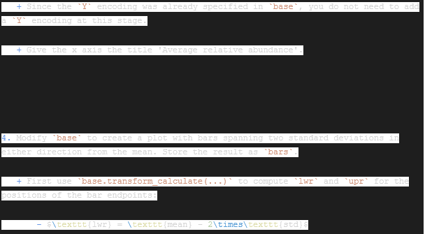
4. Modify `base` to create a plot with bars spanning two standard deviations in either direction from the mean. Store the result as `bars`.
+ First use `base.transform_calculate(...)` to compute `lwr` and `upr` for the positions of the bar endpoints:
- $\texttt{lwr} = \texttt{mean} - 2\times\texttt{std}$
- $\texttt{upr} = \texttt{mean} + 2\times\texttt{std}$.
+ Then append `.mark_errorbar().encode(...)` to the chain:
- pass `lwr:Q` to the `X` encoding channel with the title 'Average relative abundance' (to match the point plot)
- pass `upr:Q` to the `X2` encoding channel (no specific title needed).
5. Layer the plots: `means + bars`.
It may help to have a look at [this example](https://altair-viz.github.io/gallery/simple_scatter_with_errorbars.html). Once you make the plot, answer questions (i) - (iii) below.
# reset index
plot_df = diatom_summary.reset_index().rename(columns={'index': 'name'})
# create base chart
base = alt.Chart(plot_df).encode(
y = alt.Y('name', title = 'Taxon', sort={'order': 'descending'})
)
# create point plot
means = base.mark_point().encode(
x = alt.X('mean', title = 'Average relative abundance')
)
# create bar plot
bars = base.transform_calculate(
lwr = 'datum.mean-2*datum.std',
upr = 'datum.mean+2*datum.std'
).mark_errorbar().encode(
x = alt.X('lwr:Q', title='Average relative abundance'),
x2 = alt.X2('upr:Q')
)
# layer
means + bars
#### (i) Which taxon is most abundant on average over time?
_The most abundant taxon is the ActinSpp._
#### (ii) Which taxon is most rare on average over time?
_The most rare taxon is StephanSpp._
#### (iii) Which taxon varies most in relative abundance over time?
_The taxon that varies the most is A_nodul._
Now that you have a sense of the typical abundances for each taxon (measured by means) and the variations in abundance (measured by standard deviations), you'll dig in a bit further and examine the variation in abundance of the most variable taxon.
### Q1 (c). Distribution of *Azpeitia nodulifer* abundance over time
Here you'll construct a few plots that will help you answer the following key exploratory questions:
* Which values are common?
* Which values are rare?
* How spread out are the values?
* Are values spread evenly or irregularly?
#### (i) Construct a density scale histogram of the relative abundances of *Azpeitia nodulifer*.
Use the `diatoms` dataframe and a bin width of 0.03 and store the histogram as `hist`.
Hint: It may help to look at *Q0 (Background: transforms in Altair)* in the previous assignment on Smoothing.
hist = alt.Chart(diatoms).mark_bar().encode(
x = alt.X('A_nodul', bin = alt.Bin(step=0.03)),
y = 'count()'
)
hist
#### (ii) Construct a kernel density estimate of the distribution.
Create and store the KDE curve as `smooth` and layer it on top of the density histogram from part i.
(*Remember*: experiment with the bandwidth parameter, and find a value that you feel captures the shape best.)
smooth = alt.Chart(diatoms).transform_density(
'A_nodul',
as_=['A_nodul', 'density'],
bandwidth = 0,
).mark_area().encode(
x = alt.X('A_nodul:Q'),
y='density:Q'
)
smooth
#### (iii) Which values are common?
_Values between 0 and 0.05 are the most common._
#### (iv) Which values are rare?
_The rarest values are those between 0.20-0.25 and then those between 0.33-0.35_
#### (v) How spread out are the values and how are they spread out?
_We can see that the largest number of measurements have a value close to zero and as the value of the measurement increases, the number of measurements with that value decreases to zero.._
#### (vi) How would you describe the shape?
_We can observe a distribution with an average close to zero (between 0.00 and 0.05)._
#### Comment: 'zero inflation'
There are a disproportionately large number of zeroes, because in many samples no *Azpeitia nodulifer* diatoms were observed. This is a common phenomenon in ecological data, and even has a name: it results in a 'zero inflated' distribution of values. The statistician to identify and name the phenomenon was Diane Lambert, whose highly influential work on the subject (>4k citations) was published in 1992.
Zero inflation can present a variety of challenges. You may have noticed, for example, that there was no bandwidth parameter for the KDE curve that *both* captured the shape of the histogram near zero *and* away from zero -- it either got the height near zero right but was too wiggly, or got the shape away from zero right but was too low near zero.
### Conditioning on a climate event
There was a major climate event during the time span covered by the diatom data. The oldest data points in the diatom data correspond to the end of the Pleistocene epoch (ice age), at which time there was a pronounced warming (Late Glacial Interstadial, 14.7 - 12.9 KyrBP) followed by a return to glacial conditions (Younger Dryas, 12.9 - 11.7 KyrBP).
This fluctuation can be seen from temperature reconstructions. Below is a plot of sea surface temperature reconstructions off the coast of Northern California. Data come from the following source:
> Barron *et al.*, 2003. Northern Coastal California High Resolution Holocene/Late Pleistocene Oceanographic Data. IGBP PAGES/World Data Center for Paleoclimatology. Data Contribution Series # 2003-014. NOAA/NGDC Paleoclimatology Program, Boulder CO, USA.
The shaded region indicates the time window with unusually large flucutations in sea surface temperature; this window roughly corresponds to the dates of the climate event.
# import sea surface temp reconstruction
seatemps = pd.read_csv('data/barron-sst.csv')
# line plot of time series
line = alt.Chart(seatemps).mark_line().encode(
x = alt.X('Age', title = 'Thousands of years before present'),
y = 'SST'
)
# highlight region with large variations
highlight = alt.Chart(
pd.DataFrame(
{'SST': np.linspace(0, 14, 100),
'upr': np.repeat(11, 100),
'lwr': np.repeat(15, 100)}
)
).mark_area(opacity = 0.2, color = 'orange').encode(
y = 'SST',
x = alt.X('upr', title = 'Thousands of years before present'),
x2 = 'lwr'
)
# add smooth trend
smooth = line.transform_loess(
on = 'Age',
loess = 'SST',
bandwidth = 0.2
).mark_line(color = 'black')
# layer
line + highlight + smooth
### Q1 (d). Conditional distributions of relative abundance
Does the distribution of relative abundance of *Azpeitia nodulifer* differ when variation in sea temperatures was higher (before 11KyrBP)?
#### (i) Plot kernel density estimates to show the distribution of relative abundances before and after 11KyrBP.
1. Use `.transform_caluculate(...)` to calculate an indicator variable, `pre_dryas`, that indicates whether `Age` exceeds 11.
2. Use `.transform_density(...)` to compute KDEs separately for observations of relative abundance before and after 11KyrBP.
+ *Hint*: group by `pre_dryas`
3. Plot the KDEs distinguished by color; give the color legend the title 'Before 11KyrBP' and store the plot as `kdes`.
4. Add a shaded area beneath the KDE curves. Adjust the opacity of the area to your liking.
kdes = alt.Chart(diatoms).transform_calculate(
pre_dryas = 'datum.Age > 11'
).transform_density(
'A_nodul',
as_ = ['A_nodul', 'density'],
groupby=['pre_dryas']
).mark_area(opacity=0.5).encode(
x = alt.X('A_nodul:Q'),
y='density:Q',
color=alt.Color('pre_dryas:N')
)
kdes
#### (ii) Describe the variation in relative abundance of *Azpeitia nodulifer* between now and 11,000 years ago.
_It can be seen that between now and 11,000 years ago, the abundance has a mean value of ~ 0.15._
#### (iii) Describe the variation in relative abundance of *Azpeitia nodulifer* between 11,000 and 14,000 years ago.
_It can be seen in the blue KDE that for Ages > 11,000 years ago, the mean abundance is around zero._
---
## 2. Visualizing community composition with PCA
So far you've seen that the abundances of one taxon -- *Azpeitia nodulifer* -- change markedly before and after a shift in climate conditions. In this part you'll use PCA to explore variation in community composition *among* all eight taxa.
### Q2 (a). Pairwise correlations in relative abundances
Before carrying out PCA it is a good idea to inspect the correlations between relative abundances directly. Here you'll compute and then visualize the correlation matrix.
#### (i) Compute the pairwise correlations between relative abundances.
Be sure to remove or set to indices the Depth and Age variables before computing the correlation matrix. Save the matrix as `corr_mx` and print the result.
*Hint:* See the [pandas documentation for `.corr()`](https://pandas.pydata.org/docs/reference/api/pandas.DataFrame.corr.html).
corr_mx = diatoms.set_index(['Age', 'Depth'])
corr_mx = corr_mx.corr()
print(corr_mx)
grader.check("q2_a_i")
#### (ii) Visualize the correlation matrix as a heatmap
Have a look at [this example](https://altair-viz.github.io/gallery/simple_heatmap.html). Notice that to make a heatmap of a matrix, you'll need to melt it into long format.
1. Melt `corr_mx` to obtain a dataframe with three columns:
+ `row`, which contains the values of the index of `corr_mx` (taxon names);
+ `column`, which contains the names of the columns of `corr_mx` (also taxon names); and
+ `Correlation`, which contains the values of `corr_mx`.
**Store the result as `corr_mx_long`.**
2. Create an Altair chart based on `corr_mx_long` and construct the heatmap by following the examples indicated above.
+ Adjust the color scheme to `blueorange` over the extent (-1, 1) to obtain a diverging color gradient where a correlation of zero is blank (white).
+ Adjust the color legend to indicate the color values corresponding to correlations of 1, 0.5, 0, -0.5, and -1.
+ Sort the rows and columns in ascending order of correlation.
# melt corr_mx
#corr_mx_long = pd.melt(corr_mx, value_vars = corr_mx.columns).rename(columns = {'variable': 'row', 'value': 'Correlation'})
corr_mx_long = pd.melt(corr_mx, value_name = 'Correlation')
corr_mx_long['col'] = ''
row_idx = 0
for i in range(len(corr_mx)):
for j in range(len(corr_mx.columns)):
corr_mx_long.loc[row_idx, 'col'] = corr_mx.columns[j]
row_idx += 1
corr_mx_long = corr_mx_long.rename(columns = {'variable': 'row'})
corr_mx_long = corr_mx_long[['row', 'col', 'Correlation']]
corr_mx_long.head()
# construct plot
alt.Chart(corr_mx_long).mark_rect().encode(
x= alt.X('row:O', sort={'order': 'ascending'}),
y= alt.Y('col:O', sort={'order': 'ascending'}),
color= alt.Color('Correlation:Q', scale = alt.Scale(scheme = 'blueorange', bins = [1, 0.5, -0.5, -1]))
)
grader.check("q2_a_ii")
#### (iii) How does the relative abundance of *Azpeitia nodulifer* seem to covary with the other taxa?
_It can be seen that Azpeitia nodulifier (A_nodul) does not seems to have stronger negative correlation with A_curv, A_ctinSpp, CyclotSpp and Rop_tess._
### Q2 (b). Computing and selecting principal components
Here you'll perform all of the calculations involved in PCA and check the variance ratios to select an appropriate number of principal components. The parts of this question correspond to the individual steps in this process.
#### (i) Center and scale the data columns.
For PCA it is usually recommended to center and scale the data; set Depth and Age as indices and center and scale the relative abundances. Store the normalized result as `pcdata`.
# helper variable pcdata_raw; set Depth and Age as indices
pcdata_raw = diatoms.set_index(['Depth', 'Age'])
# center and scale the relative abundances
#pcdata = (pcdata_raw - pcdata_raw.min())/(pcdata_raw.max() - pcdata_raw.min())
pcdata = (pcdata_raw - pcdata_raw.mean())/pcdata_raw.std()
pcdata.head()
grader.check("q2_b_i")
#### (ii) Compute the principal components.
Compute *all 8* principal components. (For this part you do not need to show any specific output.)
pca = PCA(n_components = pcdata.shape[1])
pca.fit(pcdata)
grader.check("q2_b_ii")
#### (iii) Examine the variance ratios.
Create a dataframe called `pcvars` with the variance information by following these steps:
1. Store the proportion of variance explained (called `.explained_variance_ratio_` in the PCA output) as a dataframe named `pcvars` with just one column named `Proportion of variance explained`.
2. Add a column named `Component` to `pcvars` with the integers 1 through 8 as values (indicating the component number).
3. Add a column named `Cumulative variance explained` to `pcvars` that is the cumulative sum of `Proportion of variance explained`.
+ *Hint*: slice the `Proportion of variance explained` column and use `.cumsum(axis = ...)`.
Print the dataframe `pcvars`.
# store proportion of variance explained as a dataframe
pcvars = pd.DataFrame(pca.explained_variance_ratio_, columns = ['Proportion of variance explained'])
# add component number as a new column
pcvars['Component'] = range(1,9)
# add cumulative variance explained as a new column
pcvars['Cumulative variance explained'] = pcvars['Proportion of variance explained'].cumsum(axis = 0)
# print
pcvars.head()
grader.check("q2_b_iii")
#### (iv) Plot the variance explained by each PC.
Use `pcvars` to construct a dual-axis plot showing the proportion of variance explained (left y axis) and cumulative variance explained (right y axis) as a function of component number (x axis), with points indicating the variance ratios and lines connecting the points.
Follow these steps:
1. Construct a base chart that encodes only `Component` on the `X` channel. Store this as `base`.
2. Make a base layer for the proportion of variance explained that modifies `base` by encoding `Proportion of variance explained` on the `Y` channel. Store the result as `prop_var_base`.
+ Give the `Y` axis title a distinct color of your choosing via `alt.Y(..., axis = alt.Axis(titleColor = ...))`.
3. Make a base layer for the cumulative variance explained that modifies `base` by endocing `Cumulative variance explained` on the `Y` channel. Store the result as `cum_var_base`.
+ Give the `Y` axis title another distinct color of your choosing via `alt.Y(..., axis = alt.Axis(titleColor = ...))`.
4. Create a plot layer for the proportion of variance explained by combining points (`prop_var_base.mark_point()`) with lines (`prop_var_base.mark_line()`). Store the result as `cum_var`.
+ Apply the color you chose for the axis title to the points and lines.
5. Repeat the previous step for the cumulative variance explained.
+ Apply the color you chose for the axis title to the points and lines.
6. Layer the plots together using `alt.layer(l1, l2).resolve_scale(y = 'independent')`.
# encode component axis only as base layer
base = alt.Chart(pcvars).encode(
x = alt.X('Component')
)
# make a base layer for the proportion of variance explained
prop_var_base = base.encode(
alt.Y('Proportion of variance explained', axis = alt.Axis(title = 'Proportion of variance explained', titleColor='red'))
)
# make a base layer for the cumulative variance explained
cum_var_base = base.encode(
alt.Y('Cumulative variance explained', axis = alt.Axis(title = 'Cumulative variance explained', titleColor = 'blue'))
)
# add points and lines to each base layer
cum_var = [prop_var_base.mark_point(color='red'), cum_var_base.mark_line(color='blue')]
# layer the layers
alt.layer(cum_var[0], cum_var[1]).resolve_scale(y='independent')
#### (v) How many PCs?
How many principal components capture a high proportion of covariation in relative abundances? How much total variation do these explain together?
_We can see that at least 4 components captures a higher variation and the total variation at component 4 is around 0.47._
### Q2 (c). Interpreting component loadings
Now that you've performed the calculations for PCA, you can move on to the fun part: figuring out what they say about the data!
The first step in this process is to examine the loadings. Each principal component is a linear combination of the relative abundances by taxon, and the loadings tell you *how* that combination is formed; the loadings are the linear combination coefficients, and thus correspond to the weight of each taxon in the corresponding principal component. Some useful points to keep in mind:
* a high loading value (negative or positive) indicates that a variable strongly influences the principal component;
* a negative loading value indicates that
+ increases in the value of a variable *decrease* the value of the principal component
+ and decreases in the value of a variable *increase* the value of the principal component;
* a positive loading value indicates that
+ increases in the value of a variable *increase* the value of the principal component
+ and decreases in the value of a variable *decrease* the value of the principal component;
* similar loadings between two or more variables indicate that the principal component reflects their *average*;
* divergent loadings between two sets of variables indicates that the principal component reflects their *difference*.
#### (i) Extract the loadings from `pca`.
Store the loadings for the first two principal components (called `.components_` in the PCA output) in a dataframe named `loading_df`. Name the columns `PC1` and `PC2`, and append a column `Taxon` with the corresponding variable names, and print the resulting dataframe.
# store the loadings as a data frame with appropriate names
loading_df = pd.DataFrame(pca.components_[:2].T, columns = ['PC1', 'PC2'])
# add a column with the taxon names
loading_df['Taxon'] = pcdata_raw.columns[:loading_df.shape[0]]
# print
loading_df.head()
grader.check("q2_c_i")
#### (ii) Loading plots
Construct a line-and-point plot connecting the loadings of the first two principal components. Display the value of the loading on the y axis and the taxa names on the x axis, and show points indicating the loading values. Distinguish the PC's by color, and add lines connecting the loading values for each principal component.
*Hint*: you will need to first melt `loading_df` to long form with three columns -- the taxon name, the principal component (1 or 2), and the value of the loading.
# melt from wide to long
loading_df_melted = pd.melt(loading_df, value_vars = ['PC1', 'PC2', 'Taxon'])
# create base layer with encoding
base = alt.Chart(loading_df).encode(
x = alt.X('Taxon', title = 'Taxon Name')
)
# store horizontal line at zero
# rule = base.mark_rule().encode(
# )
pca1= base.mark_line(
point=alt.OverlayMarkDef(color="red"),
color = 'red'
).encode(
y = alt.Y('PC1')
)
pca2 = base.mark_line(
point=alt.OverlayMarkDef(color="blue"),
color = 'blue'
).encode(
y = alt.Y('PC2')
)
# layer points + lines + rule to construct loading plot
loading_plot = pca1+pca2
# show
loading_plot
#### (iii) Interpret the first principal component.
Indicate the following:
* which taxa are up-weighted and which are down-weighted;
* how you would describe the principal component in context (*e.g.*, average abundance among a group, differences in abundances, etc.);
* and how you would interpret a positive value of the PC versus a negative value of the PC in terms of diatom communnity composition.
_We can see that the taxon that are up-weighed are A_nodul and CoscinSpp, since the loadings for these variables are positive._
_A positive value of PC indicates that an increase in its value causes and increase in the value of the variable. This can be interpreted as: the variables/PC are directly proportional._
#### (iv) Interpret the second principal component.
Indicate the following:
* which taxa are up-weighted and which are down-weighted;
* how you would describe the principal component in context (*e.g.*, average abundance among a group, differences in abundances, etc.);
* and how you would interpret a positive value of the PC versus a negative value of the PC in terms of diatom community composition.
_In this case we see that the taxon up-weighted are A_nodul and Rop_tess. As explained before, A positive value of PC indicates that an increase in its value causes and increase in the value of the variable. This can be interpreted as: the variables/PC are directly proportional._
### Q2 (d). Visualizing community composition
Take a moment to recall that there was a shift in the *A. nodulifer* abundance before and after around 11,000 years ago, which roughly corresponded to a major transition in the earth's climate.
Well, you can now use PCA to investigate whether not just individual abundances but *community composition* may have shifted around that time. To that end, let's think of the principal components as 'community composition indices':
* consider PC1 a nodulifer/non-nodulifer community composition index; and
* consider PC2 a complex community composition index.
A pattern of variation or covariation in the principal components can be thought of as reflecting a particular ecological community composition dynamic -- a way that community composition varies throughout time. Here you'll look for distinct patterns of variation/covariation before and after 11,000 years ago via an exploratory plot of the principal components.
#### (i) Project the centered and scaled data onto the first two component directions.
This sounds a little more complicated than it is -- all that means is compute the values of the principal components for each data point.
Create a dataframe called `projected_data` containing just the first two principal components as two columns named `PC1` and `PC2`, and two additional columns with the Age and Depth variables.
Print the first four rows of `projected_data`.
# project pcdata onto first two components; store as data frame
projected_data = pd.DataFrame(data = pca.transform(pcdata)).loc[:,:1]
# add index and reset
projected_data.index = pcdata.index
projected_data = projected_data.reset_index().rename(columns={0:'PC1',1:'PC2'})
# print first four rows
projected_data.head(4)
grader.check("q2_d_i")
#### (ii) Construct a scatterplot of PC1 and PC2 by age indicator.
Follow these steps to construct a scatterplot of the principal components.
1. Create an Altair chart based on `projected_data` and use `.transform_calculate(...)` to define a variable `since_11KyrBP` that indicates whether `Age` is older than 11,000 years. Store the result as `base`.
2. Modify `base` to add points with the following encodings.
+ Pass PC1 to the `X` encoding channel and title the axis 'A. Nodulifer/non-A. nodulifer composition'.
+ Pass PC2 to the `Y` encoding channel and title the axis 'Complex community composition'.
+ Pass the variable you created in step 1. to the `color` encoding channel and title it 'More recent than 11KyrBP'.
Store the result as `scatter`.
Show the scatterplot once you complete these steps.
# base chart
base = alt.Chart(projected_data).transform_calculate(
since_11KyrBP = 'datum.Age > 11'
).encode(
x = alt.X('Age', title='Age')
)
# data scatter
scatter = base.mark_point(color='red').encode(
x = alt.X('PC1', title = 'A. Nodulifer/non-A. nodulifer composition'),
y = alt.Y('PC2', title = 'Complex community composition'),
color = alt.Color('since_11KyrBP:N', title = 'More recent than 11KyrBP')
)
# show
scatter
#### (iii) Add top and side panels with KDE curves.
Construct plots of kernel density estimates for each principal component conditional on age being older than 11,000 years:
* modify `base` to create a `top_panel` plot with the KDE curves for PC1, with color corresponding to the age indicator from the `.transform_calculate(...)` step in making the base layer;
* modify `base` again to create a `side_panel` plot with the KDE curves for PC2, rotated 90 degrees relative to the usual orientation (flip the typical axes), and with color corresponding to the age indicator from the `.transform_calculate(...)` step in making the base layer.
Then, resize these panels appropriately (top should be thin, side should be narrow), and use Altair's faceting operators `&` (vertical concatenation) and `|` (horizontal concatenation) to combine them with your scatterplot.
# construct upper panel (kdes for pc1)
top_panel = base.transform_density(
'PC1',
as_ = ['PC1', 'density'],
groupby=['since_11KyrBP']
).mark_area(orient='horizontal', opacity=0.6).encode(
x='PC1',
y='density:Q',
color=alt.Color('since_11KyrBP:N')
)
# construct side panel (kdes for pc2)
side_panel = base.transform_density(
density = 'PC2',
groupby=['since_11KyrBP'],
as_ = ['PC2', 'density']
).mark_area(orient='vertical', opacity=0.6).encode(
x='density:Q',
y = 'PC2',
color=alt.Color('since_11KyrBP:N')
)
# facet
side_panel & (scatter | top_panel)
---
## 3. Communicating results
Take a moment to review and reflect on the results of your analysis in the previous parts. Think about how you would describe succinctly what you've learned from the diatom data.
### Q3 (a). Summary
Write a brief paragraph (3-5 sentences) that addresses the following questions by referring to your final plot in Q2 (d).
* How would you characterize the typical ecological community composition of diatom taxa before and after 11,000 years ago?
+ *Hint*: focus on the side and top panels and the typical values of each index in the two time periods.
* Does the variation in ecological community composition over time seem to differ before and after 11,000 years ago?
+ *Hint*: focus on the shape of data scatter.
_It is clear that the climatic events mentioned in this work drastically altered the concentration of each Taxom. This is evident in the graphs where it is grouped based on whether the measurement is less than or greater than 11,000 years. In the case of measurements between a time interval from 11,000 years ago to the present, we see that the average concentration of each taxon was reduced._
### Q3 (b). Further work
What more might you like to know, given what you've learned? Pose a question that your exploratory analysis raises for you.
#### Answer
*TAmong the future works, a more internal study on each variable can be recommended and perform linear regressions that allow predicting the values.*
---
To double-check your work, the cell below will rerun all of the autograder tests.
grader.check_all()
string name;
};
// Initialize a patient
Patient::Patient(const string& name)
: name(name)
{
}
// Return the name
string Patient::getName() const
{
return name;
}
#endif
TEXT MENU APP
#ifndef textmenuapp_h
#define textmenuapp_h
#include "appointments.hpp"
#include
using namespace std;
// Handle the text based user interface menu
class TextMenuApp
{
public:
// Constructor
TextMenuApp(Appointments &patientManager);
// Operations
void run();
private:
Appointments patientManager;
};
// Initialize the text menu app
TextMenuApp::TextMenuApp(Appointments& patientManager)
: patientManager(patientManager)
{
}
// Run the text menu app
void TextMenuApp::run()
{
while (true)
{
// Display options to user on what they want to do
cout << "Menu" << endl;
cout << "1. Print all patient information" << endl;
cout << "2. Print all appointment information" << endl;
cout << "3. Add appointment for a patient" << endl;
cout << "4. Clear a scheduled appointment" << endl;
cout << "0. Exit" << endl;
cout << "Option: ";
int option;
cin >> option;
// Execute the user's option
if (option == 1)
{
// Print all patients
patientManager.printPatients();
}
else if (option == 2)
{
// Print all appointments
patientManager.printAppointments();
}
else if (option == 3)
{
// Appoint a patient to a schedule
cout << "Enter patient's name to appoint: ";
string patientName;
cin >> patientName;
cout << "Enter at what hour to appoint (8 to 15): ";
int appointmentHour;
cin >> appointmentHour;
patientManager.appointPatient(patientName, appointmentHour);
}
else if (option == 4)
{
// Clear appointed schedule
cout << "Enter at what hour you want to free (8 to 15): ";
int appointmentHour;
cin >> appointmentHour;
patientManager.freeAppointment(appointmentHour);
}
else if (option == 0)
{
// Exit program
break;
}
}
}
#endif